Kindred — Collaboration Layer
Dropbox is great at storing files, but the communication around those files is usually scattered across Slack, emails, and meetings.
I wanted to explore what collaboration could look like if reviews, feedback, ownership, and active work stayed connected directly to Dropbox’s existing file system instead of living across separate tools.
The real workflow problems started after the file was shared
Uploading files into Dropbox usually wasn’t the issue.
The problems started once the file began moving between people.
Someone shares it in Slack. Feedback happens in a meeting. Another version gets uploaded later.
At some point somebody asks:
Or:
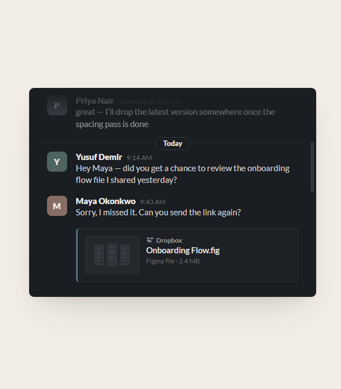
People spend time asking questions the file should’ve answered on its own.
The file moved but not with the context.
Connecting reviews and ownership directly to the file system
I wanted collaboration to feel less scattered.
Instead of pushing teams into another project management tool, I explored what it could look like if reviews, feedback, and ownership stayed connected directly to the files themselves.
People usually know which team owns a file before they know the exact person
One of the first workflow problems I explored was how files should move between people.
At first, the idea was straightforward: assign files directly to teammates for ownership or review.
But the more I thought about larger teams, the less realistic that felt.
A lot of the time, people don’t actually know who should review something yet. They only know which team owns it.
So instead of routing everything directly to individuals, files could also move through shared team queues before ownership became clearer internally.
Then I asked who’s actually allowed to assign
Team queues sounded clean until I thought about permissions.
Dropbox is really a permissions system. Anything I attached to a file had to follow rules that were already there.
The case that worried me was a file shared with someone outside the team. They shouldn’t see everything the team is working on just because they got handed one file.
So I split it: being assigned a file lets you act on that file, but it doesn’t open the rest of the workspace.
More information started making the workspace harder to scan
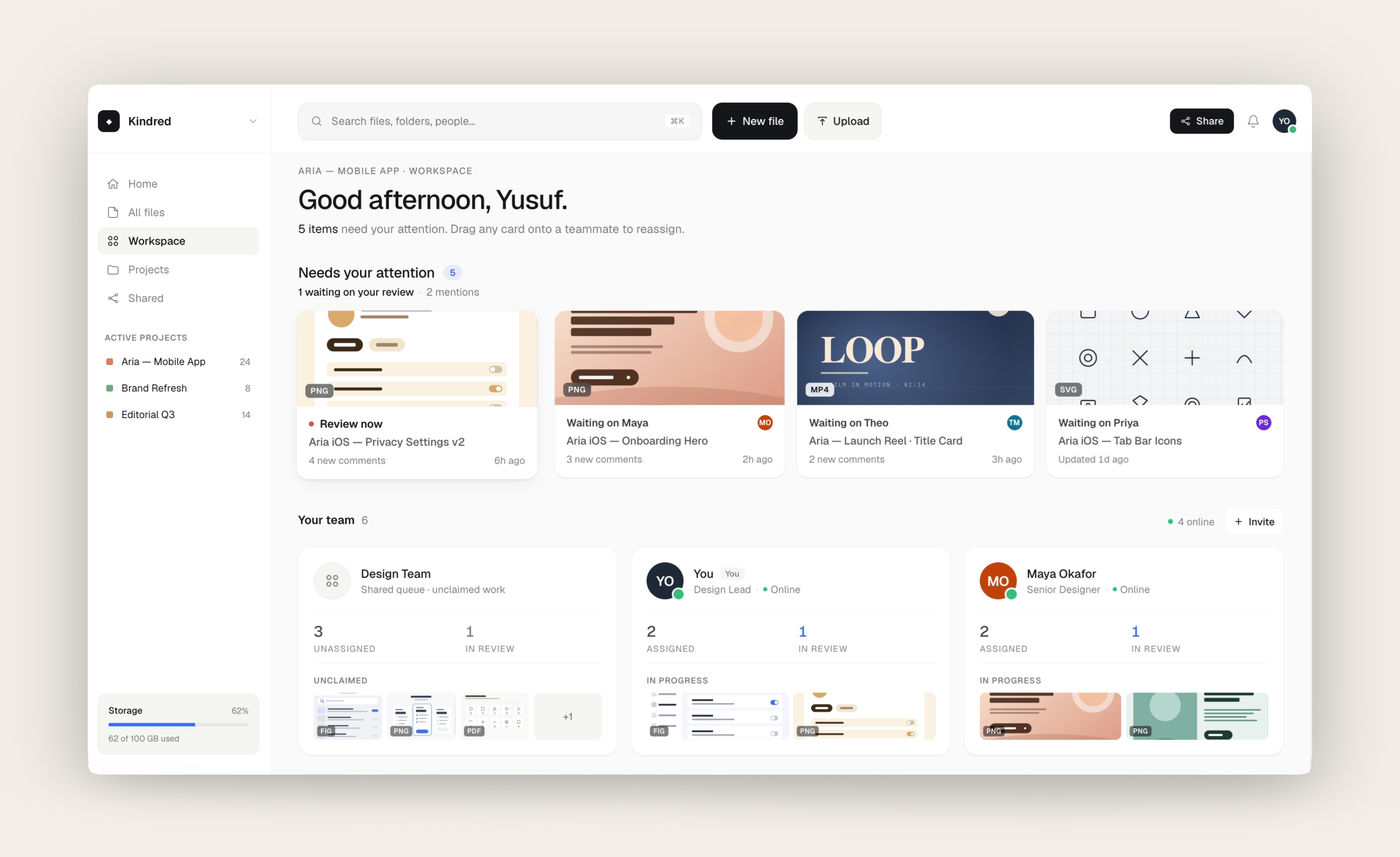
The first version focused mostly on visibility.
Files moved through lightweight states like Draft, In Review, Final, and Approved.
I also started adding more context directly onto the cards so people could quickly see:
At first, it felt helpful because everything was visible.
But over time, the cards became harder to scan quickly.
The more information I added, the harder it became to answer:
That’s when I started removing things again.
Smaller updates needed a persistent place to live
While working on the dashboard, I noticed a lot of smaller updates disappeared once you switched context.
Recent comments, active reviews, ownership changes, and unanswered questions all became harder to track once you left a file.
At first, I thought notifications could handle it, but notifications felt too temporary for this kind of information.
Instead, I added a persistent side panel directly into the workspace.
It gave smaller updates a stable place to live without crowding the main experience.
The project became less about adding features and more about keeping active work visible
Some ideas technically solved the problem, but they also made the workspace feel heavier very quickly.
The more useful direction ended up being much smaller.
Instead of trying to manage entire projects, the workspace became more focused on keeping reviews, ownership, and active work visible in one place.
What I’d want to learn next
Kindred is a concept, so I’ll be honest about what I haven’t proven.
I’d want to know whether teams actually pull collaboration back onto the file, or whether the habit of working across scattered tools is just too strong to break.
And whether the file states match how teams actually think, or whether everyone bends them into something else.
The honest next step is putting the prototype in front of a few creative teams and watching where it breaks first.
The one thing I’m sure of is that less worked better. Every time I added something, it got harder to see what actually needed attention.
